Most people spend hours perfecting their expression and lighting when preparing a profile photo — and approximately zero time thinking about what is behind them. That is a significant oversight, because your background is communicating information about you to every viewer before they consciously register your face.
In BestPick's analysis of photo submissions across all goals, background quality is consistently one of the top three variables affecting overall photo score — after expression authenticity and lighting quality. A technically perfect expression in poor background conditions will underperform a slightly imperfect expression in a well-chosen background, because the background affects perceived social status, personality, and attention allocation at a level below conscious awareness.
In BestPick's review of all photo submissions, backgrounds rated as "cluttered" reduced overall photo scores by an average of 28% compared to clean backgrounds — even when the expression, lighting, and framing were otherwise identical. The background effect is larger than most people expect.
Why Backgrounds Affect Photos More Than You Think
The mechanism is cognitive load. When the brain processes a face in a photo, it simultaneously processes the entire scene. A complex or busy background requires more cognitive resources to parse — the brain has to separate the subject from the context — which increases what neuroscientists call "cognitive workload." Unravel Research's EEG studies on Tinder photos found that as cognitive workload increases from a photo, attraction scores decrease. The brain, under load, defaults to a simpler "no."
A clean background removes this friction. The brain can spend all its processing resources on your face — your expression, your eyes, your smile — rather than parsing what is on the shelf behind you or identifying the other people visible in the background.
Beyond cognitive load, backgrounds communicate social context. Research in social psychology confirms that people make inferences about personality, status, and lifestyle from environmental context visible in photos. A clean, high-quality background — whether a natural outdoor setting or a professional interior — signals that you are someone who exists in attractive, functional environments. A cluttered or low-quality background does the opposite, regardless of how good your expression is.
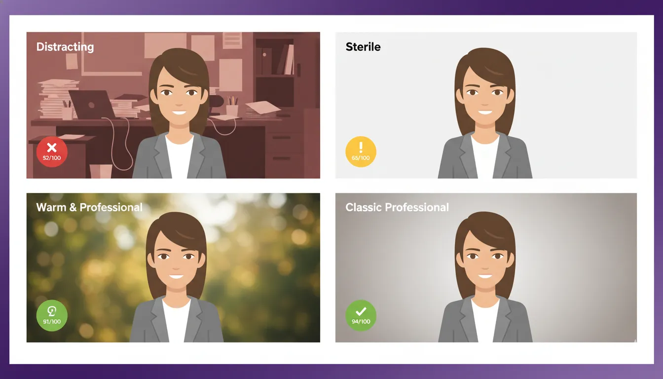
The 6 Most Common Backgrounds and How They Score
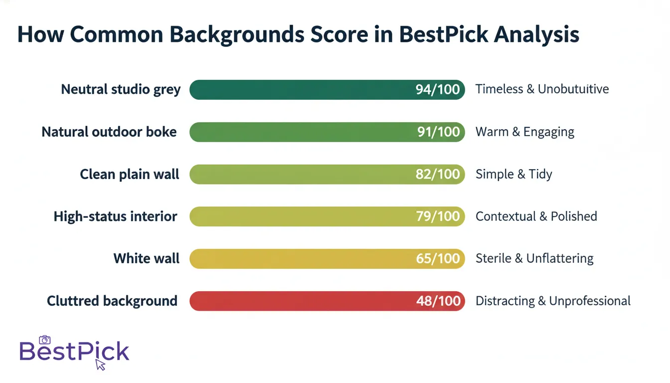
1. Natural Outdoor Bokeh — Score: 91/100
The highest-scoring background type in BestPick's analysis across all platform goals. Outdoor photographs with natural background blur — achieved by Portrait mode or a wide aperture lens — consistently outperform studio setups for non-corporate contexts. The warm tones, organic depth, and association with an active lifestyle create strong positive signals for approachability and social energy. For dating apps and Instagram, this is the single most reliable background choice.
2. Neutral Studio Grey — Score: 94/100 (LinkedIn)
For LinkedIn and professional contexts specifically, a neutral studio grey or similar solid neutral backdrop scores highest. It eliminates all background noise, focuses 100% of attention on the subject, and signals professionalism and intentionality. The reason it ranks slightly below outdoor bokeh in overall cross-platform scoring is that it performs poorly on dating apps — it reads as stiff and clinical in casual contexts. Know your platform.
3. Clean Plain Wall (Neutral Color) — Score: 82/100
A plain, matte wall in a neutral color — light grey, off-white, soft beige, muted sage — is the most accessible high-quality background for home photography. It performs strongly across all platforms. The key is ensuring the wall is genuinely clean: no visible marks, art, shelving, or cords. Even a small visual element on an otherwise plain wall creates distraction at thumbnail size.
4. High-Status Interior — Score: 79/100
A well-lit café, a clean modern library, a high-end coworking space — these backgrounds add contextual lifestyle signals that can be powerful on Instagram and dating apps. They perform less well for LinkedIn (too casual) and require careful composition to ensure the background does not dominate the frame. The risk is overcomplication: if the background is visually interesting enough to compete with your face, it is doing more harm than good.
5. Plain White Wall — Score: 65/100
Despite being technically simple, pure white walls carry three problems: overexposure risk (bright white can blow out and lose texture in high-light conditions), an ID-card or passport-photo association that reads as low-effort rather than clean, and poor subject-background contrast for people with pale skin tones. A slightly off-white or cream alternative avoids all three issues.
6. Cluttered Background — Score: 48/100
Any background where multiple objects, people, or significant visual complexity is visible scores poorly. In BestPick's analysis, cluttered backgrounds reduce overall photo scores by an average of 28% — not because viewers consciously judge the clutter, but because the cognitive processing load it creates suppresses the positive response to the subject's expression.
Platform-Specific Background Strategy
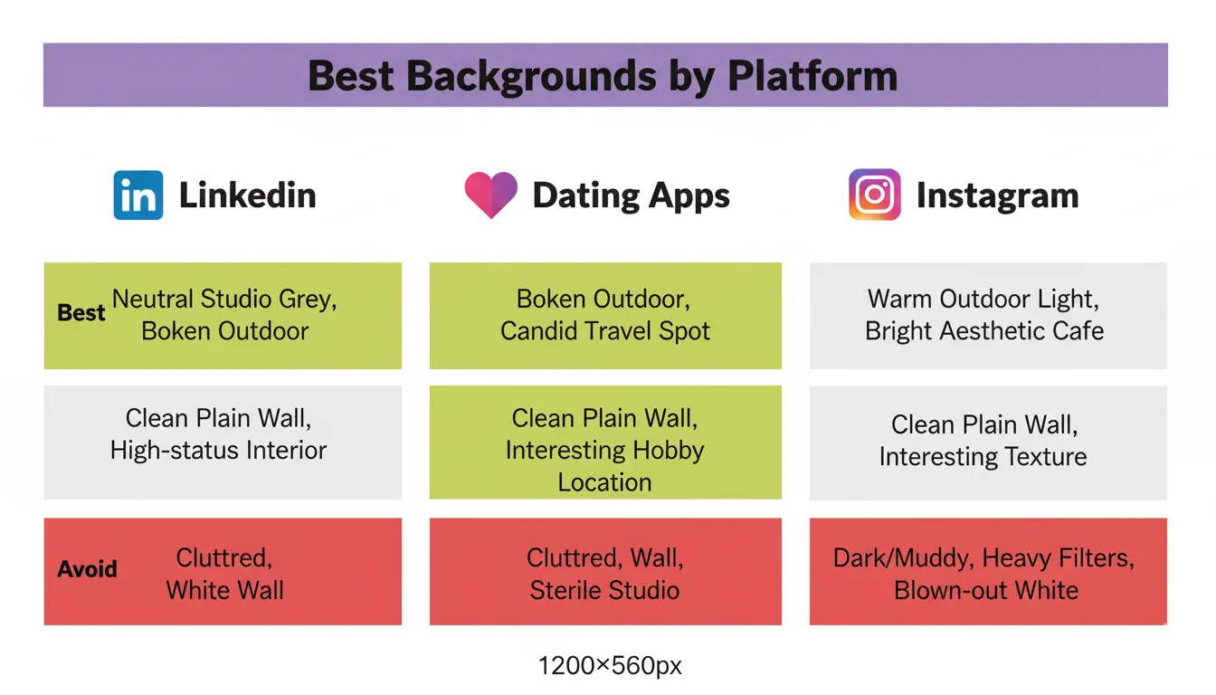
The optimal background varies significantly by platform goal, because each platform's audience has different expectations about the context in which a photo was taken:
LinkedIn: Formality signals competence. A neutral studio grey or clean indoor setting outperforms outdoor photography for professional headshots. The background should be completely unremarkable — the goal is for the viewer to have no opinion about it at all, so their full attention stays on your face.
Dating apps: Context signals lifestyle. An outdoor background — a natural setting, a city street, a recognisable location — communicates activity, social energy, and that you have a life worth knowing about. It also provides a conversational hook ("Is that the Peak District?"). Studio-grey backgrounds on dating apps read as over-prepared and lack the authentic, real-life feeling that dating profile audiences respond to.
Instagram: Aesthetic coherence matters. Your profile photo should complement your feed's visual identity. If your feed is warm and earthy, a warm outdoor background on your profile photo creates visual coherence that builds brand recognition. If your feed is clean and minimal, a simple plain wall in a complementary tone works well.
The Distance Rule: Why Standing Far From Your Background Matters
One of the most impactful and least-known background techniques: the further you stand from your background, the more naturally it blurs — even without Portrait mode or a dedicated aperture mode. At 0.5 metres from a wall, the background remains sharp and detailed. At 2 metres from the same wall, the background becomes noticeably softer.
This principle works because of how camera lenses create depth of field. The further any object is from the focus point (your face), the more out of focus it becomes. Standing 1.5–2 metres from your background before activating Portrait mode produces dramatically better background separation than standing close to the wall with Portrait mode on.
In practical terms: push your chair or standing position as far from the wall as your space allows, then activate Portrait mode. The result will be significantly cleaner separation between you and the background than most people achieve with Portrait mode alone.
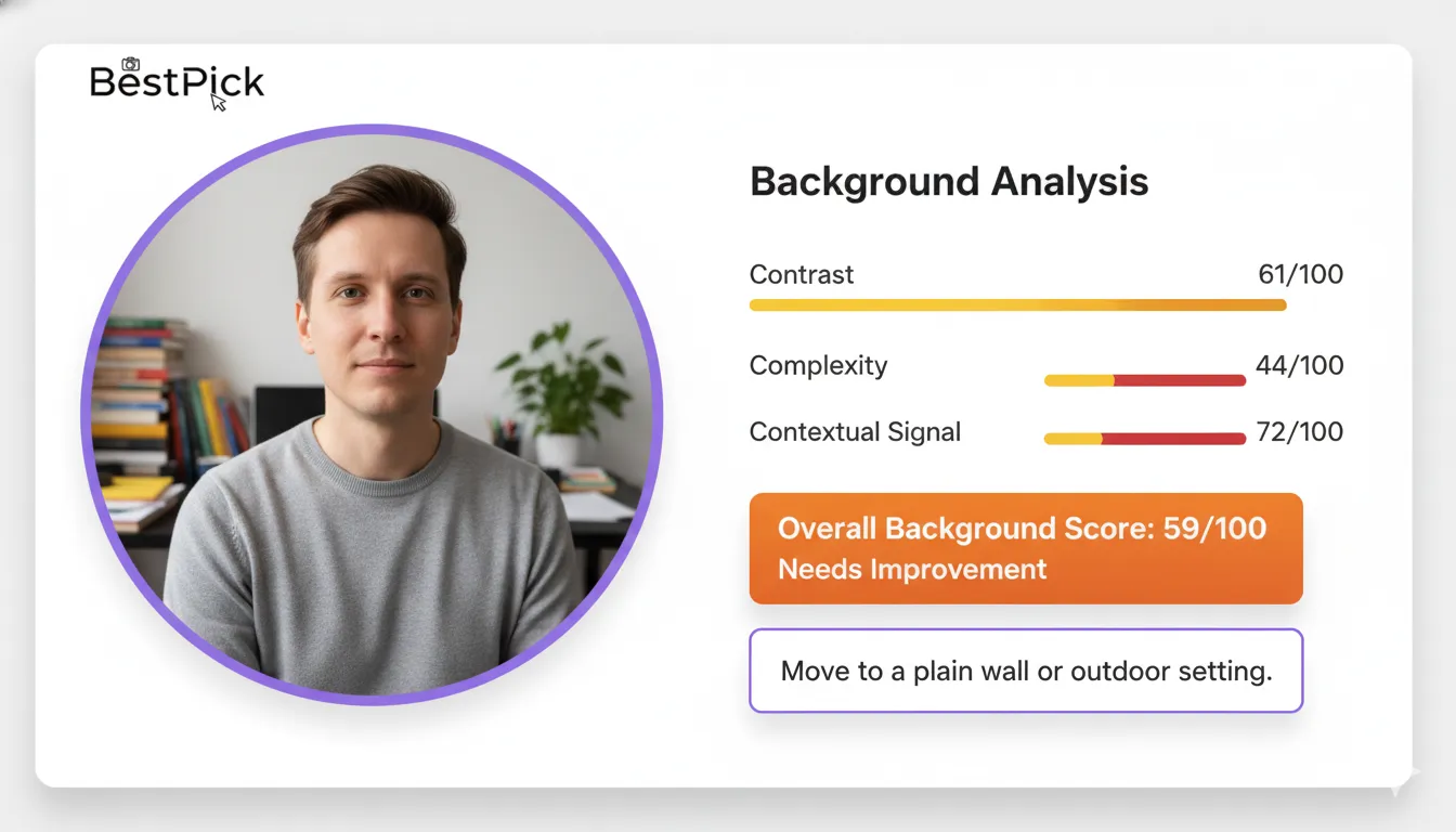
How BestPick Scores Your Background
When you upload photos to BestPick, the background assessment module evaluates three dimensions independently: contrast (does the background create clear visual separation from your face and clothing?), complexity (how much cognitive processing does the background require?), and contextual signaling (what does the background communicate about your personality and status, and is that appropriate for your selected goal?).
Each dimension contributes to the overall background score, which is one of the seven dimensions in the total photo score. You receive specific written feedback on your background: if it is reducing your score, the explanation tells you exactly why and what to change. Upload your candidate photos and select your goal — BestPick handles the analysis in under 10 seconds.
Frequently Asked Questions
Find Out How Your Background Is Scoring
Upload your photos to BestPick and get a specific background score — plus written feedback on exactly what to change — in under 10 seconds. Free, no account needed.
Analyze My Photo Background Free →