Artistic Vision
We evaluate your photo's unique composition, unconventional angles, and mood to ensure it reflects your creative identity.
AI-powered photo selection that understands artistic expression and helps you stand out in creative fields
Watch BestPick evaluate your creative shots for originality, visual impact, and artistic quality — so clients and galleries see your best work first.
Get an AI-generated score analyzing five scoring criteria including lighting, composition, clarity, and appeal.
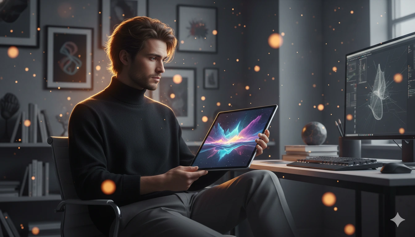
Click to browse or drag & drop
Analysis mode: Social Media
Our AI is evaluating your photo across multiple quality factors...
Upload 2–3 photos. Our AI ranks them for and explains exactly why one wins.
Drop photos here or browse
2–3 photos • JPG PNG HEIC WEBP • Max 10MB each
Artists and creatives need a different set of rules. Our AI looks for originality, emotion, and visual storytelling.
We evaluate your photo's unique composition, unconventional angles, and mood to ensure it reflects your creative identity.
Does your photo convey emotion? Our AI analyzes the narrative impact of your lighting, shadow, and environment.
Whether you're looking away or staring deep into the lens, we score the authenticity and confidence of your artistic presence.
Quick answer: the photos that work in creative portfolios prove taste, not just photogenic faces. Across the creative-goal photo analyses we've run through BestPick, the highest-scoring images share four traits — intentional lighting, a specific point of view, technical confidence, and one detail that tells the viewer "this person knows what they're doing" before they've read a single word of your bio.
The core difference between a creative portfolio photo and every other type of professional photo is the audience. A LinkedIn recruiter is asking "is this person trustworthy and competent." A dating app user is asking "do I find this person attractive." A creative director, art buyer, or gallery curator is asking something different — "does this person have an eye." That question gets answered in the first second, and it gets answered by the photo itself, not by what's in the photo.
Lighting is almost always where it shows up first. The strongest creative portfolio photos in our system rarely use flat, even, neutral light — that's wedding photography or LinkedIn territory. They use deliberate light. Hard side light that creates strong shadow. Window light that catches half the face. A single warm source against an otherwise dark frame. Color light. Coloured backgrounds. The photographer made a choice, and the viewer can feel the choice. Generic soft light reads as "I didn't have a plan."
The second thing is consistency with your work. If you're a graphic designer who works in bold, high-contrast, color-blocked layouts, your portrait should not be a soft, neutral, beige headshot. If you're an illustrator with a delicate watercolor style, your portrait should not be a hard-shadow rock-band shot. Your About Me photo is a piece of your visual identity, and the easiest way to lose a creative client in 0.8 seconds is to have a portrait that contradicts the rest of the portfolio. The photo and the work need to feel like they came from the same person.
These show up across our creative photo analyses regardless of medium — designers, photographers, illustrators, models, actors. Same five mistakes. Each one has a measurable effect on how a photo scores.
Plain grey backdrop, even softbox lighting, slight smile, professional attire. It's a perfect LinkedIn photo and a terrible creative portfolio photo. Hiring directors at agencies and studios specifically don't want this — they want to see someone who would push their visual brand somewhere interesting. If your portrait could appear on a law firm's website without anyone noticing, it's wrong for here.
Selfies signal that you couldn't be bothered to set up a camera. For creative work, that reads as either careless or unable to direct a shoot — both fatal in fields where the entire job is composing visuals. Even a phone propped on a stack of books with a 10-second timer outscores any selfie. The bar is "you clearly thought about the shot," not "you have professional equipment."
This destroys credibility faster than any other single thing for creative work. The audience for your portfolio is people who do visual work for a living — they will spot the smoothed skin, the elongated jaw, the suspicious symmetry, the AI-generated portrait. And they'll quietly assume you don't trust your own face, which translates to "doesn't trust their own work." Use real photos, real skin, real texture.
Hand on chin, looking pensive into the distance. Sitting on a stool with crossed arms in front of a brick wall. Holding a paint brush you don't actually use. These poses signal effort without authenticity, and creative directors have seen them a thousand times. The strongest creative portraits look like the person was caught mid-action or mid-thought, not posed for a stock-photo audition.
For creatives more than for any other field, your portrait should match the era your work currently exists in. A 2019 portrait next to 2026 work creates a small but real disconnect — viewers can't tell whether your work is current or whether you've been recycling the same portfolio for years. Refresh your About Me photo every two to three years minimum, more often if your visual style has evolved.
Quick answer: these two photos do completely different work, and using the same image for both is one of the most common mistakes in creative portfolios. One photo is about you. The other is about your taste.
The About Me photo is a portrait. Its job is to put a face to the name and signal personality, taste, and confidence. It lives on your About page, your social profiles, your Behance or Cargo bio, and sometimes in the corner of your homepage. The strongest creative About Me photos in our system show the person clearly, with intentional lighting, in an environment or context that hints at how they think. It doesn't need to be a tight headshot — full-body or environmental portraits often work better for creatives — but the face has to be readable, and the viewer has to be able to form an impression of who you are in under two seconds.
The portfolio hero image is something completely different. It's not a photo of you — it's a piece of your work, or a moment that represents your work. This is the first image a visitor sees on your portfolio homepage, the lead image on your case study, the first frame of your Instagram grid. Its job is to demonstrate taste before the viewer has read anything. It should be your strongest piece, not a chronological default. The photo or design or frame that, if it were the only thing they saw, would still make them want to see more.
The mistake is collapsing them. Putting a portrait of yourself in the hero slot makes the portfolio feel like it's about you, not your work. Putting a piece of your work in the About Me slot makes the bio feel hollow and the visitor never gets the human signal. Use both, separately. Treat them as having different audiences, even though they're often the same person — the visitor is looking for different things at different moments, and the photos have to answer in different voices.
No black box. Here's exactly what we evaluate when you select "Creative" as your goal.
Whether the photo demonstrates a deliberate creative point of view. We score higher for intentional choices — distinctive framing, considered color, unusual angles, mood that feels chosen rather than accidental. Generic "well-lit portrait" energy loses points here.
The narrative pull of the image. Does the photo feel like it's part of a larger story or moment? We score higher for images that imply context, action, or emotion. Posed portraits with no implied story score lower, even when technically clean.
How deliberately the light is used. Strong directional light, considered shadow, color choice, and contrast all score well. Flat soft light from all directions — the safe default — loses points. Creative portraits should feel lit, not just illuminated.
Framing, balance, negative space, leading lines, and subject placement. We check whether the photographer made deliberate compositional choices that hold the viewer's eye, or whether the subject is just centered and shot from straight on.
How present the subject feels — whether through eye contact, body language, or the energy in the frame. Distant, disengaged, or self-conscious portraits lose points. Photos where the person seems comfortable and intentional in the moment score highest.
Upload 2 to 6 of your creative portfolio photo candidates above and you'll see exactly how each one scores against these five criteria. About 5 seconds, no signup, free.
No. While LinkedIn demands corporate professionalism, creative fields value authenticity and personality. You have more freedom with lighting, background textures, and attire.
Our creative model has been trained to appreciate dramatic lighting, intentional color grading, and non-standard framing that would typically be penalized in standard corporate headshots.
Yes, the AI will help you pick the most visually striking "About Me" photo for your personal website, portfolio, or casting profiles.