The color of your clothing in a profile photo is one of the most overlooked yet consistently impactful variables we identify in BestPick analyses. It affects background contrast, perceived warmth, professional signaling, and first-impression ratings — all of which BestPick's AI measures as part of the overall photo score.
After processing thousands of photo submissions with detailed clothing color data, patterns have emerged that are clear enough to make specific, platform-tailored recommendations. This is not color theory — it is pattern data from real photos with real user outcomes.
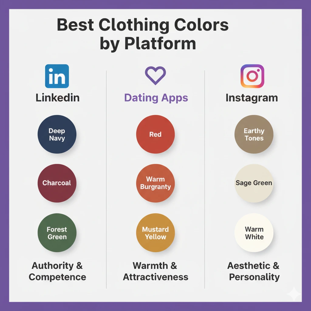
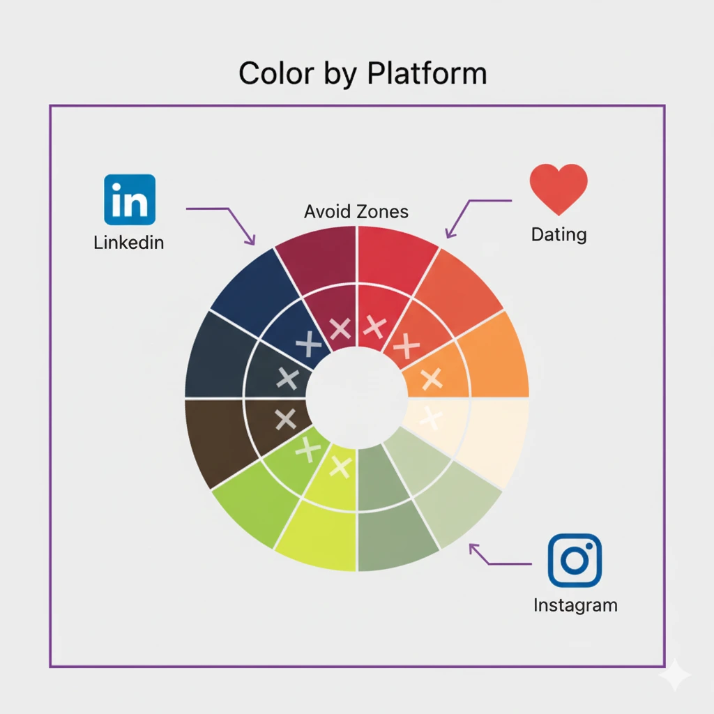
In BestPick's analysis of LinkedIn-goal submissions, photos where the subject wore deep blue or navy scored an average of 22% higher on professional impression than photos where the subject wore black or grey. For dating-goal submissions, warm-toned clothing (red, terracotta, burgundy) correlated with 19% higher warmth scores.
The Psychology of Color in Portraits
Color psychology in photography works through two mechanisms: the direct psychological effect of the color itself on the viewer's emotional state, and the practical effect of the color on photo quality — specifically contrast, skin tone rendering, and visual separation between subject and background.
Both mechanisms matter for profile photos, and they do not always favor the same colors. A bright yellow shirt is energetic and warm (positive psychological signal) but can cause severe color cast on skin in mixed lighting (negative photo quality effect). Understanding both dimensions is why color choice is more nuanced than most "what to wear for headshots" advice acknowledges.
Best Colors for LinkedIn Profile Photos
Deep navy blue is the highest-scoring color in BestPick's LinkedIn submissions. It signals authority and competence without the coldness of black, provides excellent contrast against most backgrounds, and does not create color cast on skin under typical indoor lighting. In color psychology research, blue is consistently associated with trust, stability, and professionalism — precisely the qualities LinkedIn audiences are evaluating.
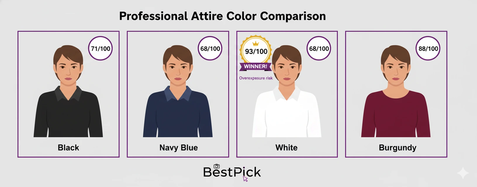
Charcoal grey performs almost as well as navy for professional contexts. It is versatile, does not distract, and reads as polished across all industries. Dark grey is preferred over black because pure black can create too much contrast and make a photo feel harsh, particularly in high-exposure conditions.
Burgundy and deep forest green are strong choices for fields where you want to project warmth and personality alongside professionalism — marketing, HR, education, creative industries. Both colors are sophisticated enough for corporate contexts while adding more personality than pure neutrals.
Avoid: neon or overly bright colors (distracting), pure white (overexposure risk), heavily patterned fabrics (distracting at small sizes), and orange (associated with lower professional status in multiple studies).
Best Colors for Dating App Profile Photos
Dating app photo color psychology diverges significantly from professional contexts. The goal shifts from projecting competence and authority to projecting warmth, approachability, and attractiveness.
Red is the most research-supported color for dating contexts. A study published in the Journal of Experimental Psychology found that both men and women were rated as significantly more attractive when wearing red compared to other colors — an effect that appears to be robust across cultures. In BestPick's dating-goal submissions, photos with red or warm-red clothing scored 19% higher on warmth and attractiveness signals than photos with cool or neutral tones.
Terracotta, warm orange-rust, and mustard yellow are strong alternatives to red for people who feel red does not suit their complexion. These warm earth tones project approachability and lifestyle — signals that perform particularly well on Hinge and Bumble where personality expression matters more than on Tinder.
Avoid: corporate grey (suppresses perceived warmth), black as a dominant color for dating profiles (reads as closed off), and heavily formal attire (creates contextual mismatch with the casual nature of dating apps).
Best Colors for Instagram Profile Photos
Instagram operates differently from both LinkedIn and dating apps. The profile photo must work both as a standalone portrait and as part of the overall aesthetic cohesion of your account. The best colors are those that align with your feed's color palette while still providing adequate contrast for the circle thumbnail.
In BestPick's Instagram-goal submissions, the highest-scoring photos featured clothing in earthy tones (sage green, warm beige, terracotta), cobalt or teal blue, and warm white or cream. These colors tend to read as authentic and aesthetic-forward rather than corporate or formal — consistent with Instagram's visual culture in 2026.
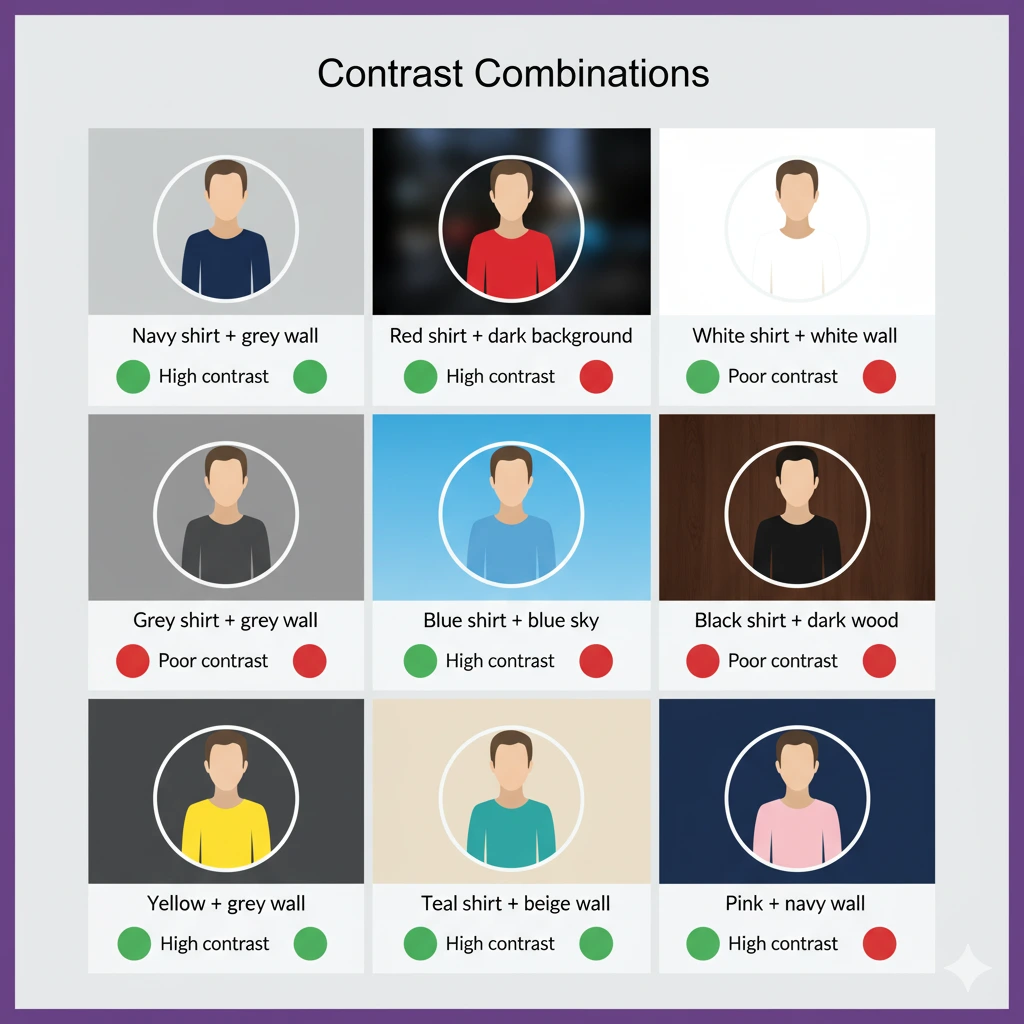
How Clothing Color Affects Background Contrast
Beyond the psychological color effects, clothing color has a direct technical impact on photo quality through contrast. The most visually compelling portrait has clear tonal separation between the subject and the background — your face and clothing must stand out from whatever is behind you.
If you are shooting against a light or white wall (a common home setup), dark clothing provides automatic contrast. If you are outdoors against a green or leafy background, warmer tones (red, orange, burgundy) provide better separation than green or grey. If your background is dark (brick wall, dark interior), lighter or brighter tones work best.
BestPick's analysis consistently shows that photos with poor subject-background contrast score lower on overall quality regardless of expression quality — the brain struggles to separate the subject from the scene at small thumbnail sizes, creating cognitive load that translates to lower engagement.
Already Have Photos? Let BestPick Score Them.
Upload your candidates — including photos with different outfits — and BestPick's AI will tell you which combination of expression, lighting, and clothing performs best for your goal.
Analyze My Photos Free →